
Product Photography Lighting for Even, Controlled Ecommerce Images
Effective ecommerce product photography lighting uses a dominant key light to create readable form, then controls apparent source size, direction, distance, diffusion, and fill so the product retains sufficiently even coverage, controlled highlights, readable shadows, and visible texture without flattening its shape. Add fill or bounce only when important shadow detail is unreadable, and adjust one variable at a time so each change remains interpretable.
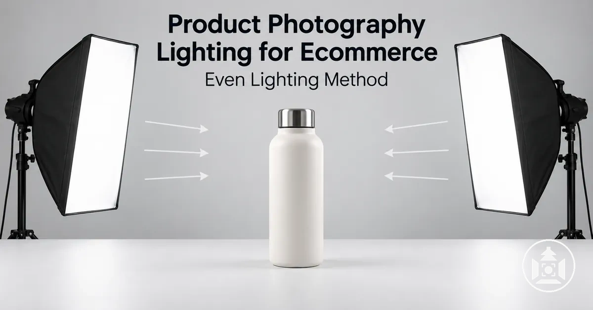
Product lighting control map
Use each control for the visible property it actually changes. Start with the key light, inspect the product, and adjust only the variable that matches the problem you can see.
- Key-light position
- Changes highlight and shadow direction. Move the light farther toward the side for stronger directional modelling and texture; move it toward the front to reduce side-to-side contrast.
- Apparent source size
- Changes transition hardness. A larger source relative to the product produces broader highlight transitions and softer shadow edges; a smaller apparent source produces crisper edges and more abrupt transitions.
- Fill or bounce
- Changes shadow density and contrast. Increase it only until required shadow detail is readable; reduce it if the product begins to look flat or a secondary shadow direction appears.
- Light-to-product distance
- Changes apparent source size, light level, and relative falloff. With source size fixed, moving closer generally makes the source appear larger and increases near-to-far falloff; moving farther does the reverse.
- Diffusers, reflectors, and flags
- Change diffusion, redirection, or spill. Use a softbox or diffusion panel to broaden or diffuse the source, a reflector to redirect existing light, and a flag to block unwanted light paths.
- Verification
- Confirms whether the setup is ready to repeat. Check coverage, highlights, shadow detail, texture, spill, and consistency, then change one variable and compare a new test image when a criterion fails.
Working sequence: set the key light → inspect highlights and shadows → add fill only if needed → refine one variable → make a test image → repeat until the product-specific criteria are met.
The goal is not uniform brightness at every point, but controlled highlights, readable shadows, and appropriate contrast across the product surface.
Useful illumination therefore depends on the product's geometry, material, desired texture, and the amount of shadow definition needed to communicate three-dimensional form.
Source size, light direction, distance, diffusion, and fill light work together to determine coverage, softness, highlights, shadows, and visible texture.
A larger apparent source, including diffusion setups that create a broader effective luminous area, can produce softer shadow transitions, while light direction changes where highlights and shadows describe the product surface.
Distance changes the source's apparent size, illumination level, and relative falloff across the product, while fill light can raise shadow detail and reduce contrast without replacing the directional information created by the main light.
The appropriate balance changes with the product: glossy surfaces require careful highlight control, while textured surfaces can need more directional contrast to keep surface detail visible.
Even lighting does not mean eliminating every shadow or highlight; controlled contrast can be necessary to preserve dimensionality instead of making the product appear flat.
Judge the lighting setup by whether it gives the ecommerce image sufficiently even coverage, controlled highlights, readable shadow detail, visible surface texture, and enough contrast to communicate the product's form accurately.
Table of Contents
What Effective Ecommerce Product Lighting Needs to Achieve
Effective ecommerce product lighting should make clear form, readable texture, controlled highlights, and useful shadow detail visible while maintaining even illumination across the product.
The image needs enough contrast to describe dimensionality without allowing highlights to obscure surface information or shadows to hide important detail.
Brightness alone is therefore insufficient to judge lighting quality.
The acceptable balance depends on the product surface and geometry.
A matte surface usually produces less concentrated reflections, so useful contrast can help reveal shape or texture; a glossy surface can produce prominent reflections that require tighter highlight control to keep the product readable.
Smooth and textured materials can likewise need different highlight and shadow relationships because the lighting must preserve the surface characteristics that distinguish the product.
The criteria below connect each product-image attribute with a visible state and its implication, making the lighting result easier to evaluate.
- Product form: Clear separation between illuminated and shaded areas supports visible shape; too little tonal separation can flatten form, while excessively dense shadows can obscure contours.
- Highlights: Controlled highlights reveal surface response and shape without becoming distracting bright areas; uncontrolled reflections can conceal detail, particularly on a glossy product surface.
- Texture: Readable texture preserves visible surface detail; insufficient contrast can suppress texture, while excessive contrast can make surface variation appear harsher than intended.
- Shadow detail: Balanced shadows retain enough information to describe depth; shadows that are too deep can hide detail, while shadows that are too weak can reduce dimensionality.
- Illumination consistency: Even illumination keeps important product areas readable without requiring every area to have identical brightness; useful contrast can remain where it communicates form and surface characteristics.
Adequate illumination is therefore defined by readable product information rather than high brightness alone.
The useful balance of highlights, shadows, texture, and contrast remains conditional on the product's surface and geometry.
The accompanying image illustrates how controlled highlights and moderate shadows can preserve surface readability without requiring uniform brightness across the product.

A Practical Lighting Setup for Even Product Illumination
A practical product photography lighting setup starts by establishing the key light, observing how it shapes the product, adding fill light only when the visible result requires it, and then refining light placement and diffusion.
The key light establishes the main direction of highlights and shadows, while the initial observation shows whether the product surface has usable form and coverage.
Fill is conditional rather than mandatory because some products already retain sufficient shadow detail from the key light alone.
Change one lighting variable at a time so the effect on highlights, shadows, softness, and coverage remains easier to interpret.
This lighting method is narrower than the broader product photography setup workflow: establish a stable lighting baseline first, then observe and verify each change before making the next adjustment.
- Establish the key light. Position the main light so its direction gives the product readable form and useful surface definition. Observe the initial highlight and shadow pattern before adding another source.
- Evaluate the visible result. Check highlights, shadows, and coverage across the product surface. Identify whether important areas are obscured, excessively bright, or receiving noticeably uneven illumination, and verify the result before changing another variable.
- Add fill only if needed. Introduce a fill light or bounce when the key light leaves shadows too dense for the required product detail. Adjust the fill until shadow information is readable while the key light still provides the dominant directional structure, then verify the result again.
- Refine placement and diffusion. Adjust light angle, source size, distance, or diffusion one variable at a time to refine softness and coverage. Observe and verify the result after each change before making another adjustment.
A small tabletop product can use this sequence with one main source and a reflector introduced only when extra fill is useful, but the same method does not prescribe a fixed number of lights.
Larger products can require broader coverage, while reflective or textured surfaces can require different source size, distance, diffusion, or light placement to keep their surface characteristics readable.
Start from the stable baseline, adjust one lighting relationship at a time, and verify the visible result before refining further.
The accompanying image shows the spatial relationship between a tabletop product, its key light, and conditional fill without duplicating the ordered adjustment sequence.

Position the Key Light to Define Shape and Surface Detail
The key light sets the dominant highlight and shadow direction, so its position defines much of the product shape and visible surface detail.
Moving the main light changes which surfaces receive more direct illumination, where highlights appear, and where shadows describe depth.
A front-biased position can reduce lateral shadow definition, while a more side-biased position can increase directional contrast across texture.
The accompanying image shows how key-light position relocates the highlight side and shadow side while changing the visibility of texture on the product.
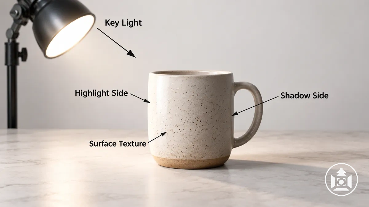
Adjust light angle, light height, and lateral position deliberately because each variable changes highlight placement, shadow direction, and the way surface detail describes product shape.
A roughly 45-degree position can serve as a starting reference, not a fixed rule; adjust from that reference according to the visible highlight and shadow pattern on the product.
Moving the key light farther toward the side can make directional texture more visible, while moving it toward the front can reduce side-to-side shadow definition.
Judge the product's visible form and texture rather than applying one fixed light angle to every product.
- Light angle: Start with a direction that produces readable separation between illuminated and shaded areas, then adjust the angle according to the visible highlight and shadow pattern.
- Light height: Raise or lower the key light while observing how the highlight position and shadow direction shift across the product.
- Lateral position: Move the key light toward the front for less side-to-side shadow definition or farther to the side when directional contrast helps reveal product shape and texture.
- Product-facing direction: Aim the key light toward the important product surface, then verify that the resulting highlight and shadow placement keeps the required surface detail visible.
Add Fill Light to Balance Contrast and Shadows
Fill light raises shadow brightness and reduces contrast while the key light retains the dominant directional role.
Increase the fill level only until important shadow detail becomes readable; stronger fill beyond that point can reduce the contrast that communicates dimensionality.
The accompanying comparison isolates this effect by showing the same product and key-light direction with minimal fill and with added fill, so the change in shadow density is visible without changing the directional modelling.
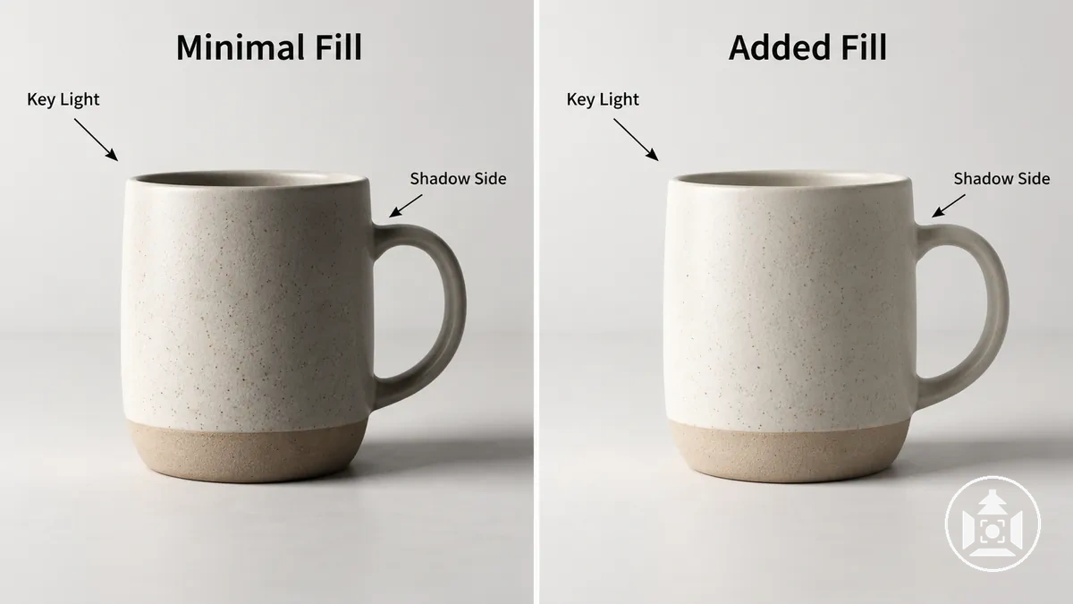
Adjust fill according to the observed shadow state rather than treating it as a mandatory second light.
Increase fill when important detail remains obscured on the shadow side, reduce it when the product begins to look flat, and reposition it when the secondary source creates a competing shadow direction.
When direct fill is stronger or more directional than needed, bounce can provide reflected fill that raises shadow brightness more subtly.
Increase fill incrementally until dense shadow detail becomes readable while enough contrast remains to preserve product form and dimensionality.
- Add fill: When important shadow detail is too dense to read, increase the fill level gradually until that detail becomes visible while the key light still controls direction.
- Reduce fill: When increased shadow brightness weakens visible depth and the product begins to look flat, lower the fill level so useful contrast and dimensionality remain.
- Move fill: When the fill creates a competing shadow direction or unevenly affects the shadow side, change its position so it supports rather than competes with the key light.
- Use bounce: When direct fill is stronger or more directional than needed, use reflected fill from a bounce surface to lift shadow detail without making the secondary source visually dominant.
Adjust Light Angle and Distance for Even Coverage
Adjust light angle and distance according to the coverage, highlight placement, shadow direction, apparent source size, and falloff visible on the product rather than using a fixed geometry.
Changes in light angle and height shift where highlights and shadows appear. With source or modifier size fixed, moving the light closer generally makes it appear larger from the product and increases near-to-far falloff; moving it farther makes it appear smaller and reduces relative falloff across the product, while also lowering the light level unless output or exposure is compensated.
The diagram isolates these placement relationships with two illustrative light positions, direction arrows, and non-numeric distance markers so the effects can be compared without implying a universal measurement.
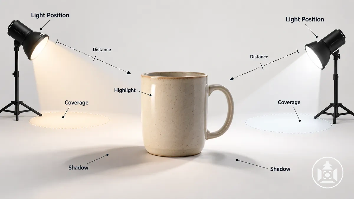
Refine one spatial variable at a time, then observe how the product changes before making another adjustment.
If one side of a product receives uneven illumination, first change placement and compare the resulting coverage and transitions instead of immediately adding another light.
A larger apparent source generally produces softer transitions, but apparent source size depends on modifier size and distance relative to the product, so distance should not be treated as an isolated control.
Continue refining until the coverage and transitions suit the product scale, modifier size, and surface behaviour while retaining deliberate shape.
- Angle: Adjust the light angle when highlights or shadows fall in positions that obscure important form or surface detail; changing the direction relocates those highlights and shadows across the product.
- Height: Raise or lower the light when the vertical placement of highlights, shadows, or coverage does not suit the product; evaluate the resulting direction and illumination across its visible surfaces.
- Distance: With source or modifier size unchanged, move the light closer when a larger apparent source and stronger near-to-far falloff suit the product; move it farther when a smaller apparent source and more even relative illumination across depth are preferable. Recheck exposure after either change because illuminance at the product also changes.
- Relative source size: Adjust the relationship between modifier size, distance, and product scale when shadow or highlight transitions are harder or softer than required; a larger apparent source generally produces softer transitions, while a smaller apparent source produces more defined transitions.
Soft Light and Hard Light Change Shadows, Texture, and Highlights
Soft light and hard light describe light quality, with the difference determined mainly by apparent source size relative to the product rather than by whether the source is natural or artificial.
A larger apparent source produces more gradual shadow and highlight transitions, while a smaller apparent source produces crisper, more abrupt transitions.
Distance and diffusion can change how large a source appears from the product's position, so the same modifier does not produce one fixed light quality in every setup.
The table compares both light qualities using the same visible criteria: shadow-edge transition, highlight transition, texture emphasis, contrast, and perceived depth.
| Visual property | Soft light | Hard light |
|---|---|---|
| Shadow edge | More gradual transition between illuminated and shaded areas | Crisper, more clearly defined transition between illuminated and shaded areas |
| Highlight transition | Broader, more gradual transition across the product surface | More abrupt transition that can make highlight boundaries more distinct |
| Texture | Lower local contrast can make fine surface texture less prominent | Stronger local contrast can emphasize surface texture and relief |
| Contrast | Tends to produce gentler tonal transitions across form | Tends to produce stronger separation between illuminated and shadowed areas |
| Perceived depth | Gradual transitions can describe form with smoother modelling | Crisper shadows and stronger contrast can make edges and surface relief appear more pronounced |
On a product surface, these differences change how shape, texture, highlights, shadows, and perceived depth are rendered rather than making either light quality universally preferable.
Soft light can suit a surface when smoother transitions and less prominent texture are wanted, while hard light can suit a product when stronger texture emphasis or more defined shadow structure supports the intended appearance.
Soft versus hard describes light quality; the separate natural versus artificial light distinction describes source category, and either source category can produce different light qualities depending on apparent source size, distance, and diffusion.
Choose between soft light and hard light according to the product surface, desired contrast, texture visibility, highlight behaviour, and perceived depth rather than treating one as inherently better.
Soft light is also distinct from soft focus: light quality changes contrast, shadow transitions, highlights, and texture rendering, which can affect perceived sharpness, but it does not by itself determine whether the optical image is in focus.
Soft Light for Gradual Highlights and Softer Shadows
Soft light is light with a gradual shadow edge, a smooth highlight transition, and gentler tonal transition across the product surface.
Its softer light-to-shadow boundary reduces abrupt contrast while still allowing highlights and shadows to describe form.
Soft light is therefore defined by the character of these transitions rather than by reduced image focus.
Texture can remain visible, although lower local contrast can make fine surface variation less prominent.
The degree of softness depends on apparent source size relative to the product, with a larger apparent source producing more gradual shadow transitions; distance, diffusion, fill, and the physical size of the source or modifier can change the visible result.
For example, on a lightly textured product surface, broader illumination can make the tonal transition across raised detail gentler, while excessive frontal fill can reduce the contrast that makes the texture and shape apparent.
Diffusion can contribute to softer illumination when it increases the effective apparent source size or changes how light reaches the surface, but the result still depends on product geometry and surface behaviour.
Soft light does not mean no shadow or no texture: useful shadows and surface detail can remain when the lighting preserves enough directional contrast to describe form.
Hard Light for Crisp Shadows and Stronger Texture
Hard light is a light quality that produces a crisp shadow boundary, stronger contrast, and a more concentrated highlight on the product surface.
These defined light-to-shadow transitions can make edges, relief, and texture more visually pronounced when the light direction crosses surface detail.
A concentrated highlight can also become prominent on a specular surface, so its position and intensity need to support rather than obscure the required product detail.
Hard light can therefore be a deliberate rendering choice when defined shadows or texture are useful to the image.
A small apparent source produces crisper shadow transitions than a larger apparent source under comparable conditions, while directional light controls where those shadows and highlights fall across the product.
For example, directing harder light across a textured fabric or embossed product surface can create small highlight-and-shadow changes around raised detail, increasing local contrast and making the texture easier to distinguish.
The strength of that effect depends on light direction and distance, product material, surface reflectivity, and the intended visual result; on a specular surface, the same setup can produce a concentrated highlight or reflection that becomes distracting if it covers important detail.
Use hard light when its crisp shadow structure, concentrated highlights, and surface emphasis support the required product rendering rather than treating those characteristics as either inherently desirable or defective.
Using Light Modifiers to Control Diffusion, Direction, and Spill
A light modifier changes how an existing light source behaves by altering diffusion, direction, spill, reflection, concentration, or apparent source size.
A softbox or diffusion panel can broaden or diffuse the light reaching a product, while a reflector redirects incident light and a flag restricts light from reaching unwanted areas.
The visible result depends on modifier size and placement, source geometry, viewing angle, and the product surface, so modifier choice should begin with the light behaviour that needs adjustment rather than with a particular accessory.
Select a modifier by identifying whether the lighting problem requires softer transitions, redirected light, restricted spill, or greater concentration.
The functional relationship between the modifier, changed light behaviour, and visible result can be organised as follows.
- Soften or broaden: A softbox, diffusion panel, or scrim can increase diffusion or change apparent source size, producing smoother light-to-shadow transitions and broader highlight transitions when its size and placement create a sufficiently broad source relative to the product.
- Redirect or fill: A reflector or other bounce surface redirects light toward the product, which can raise shadow detail or alter reflection placement without introducing another powered source.
- Restrict or control: A flag blocks selected light paths to reduce spill, while grids, snoots, or related light-control tools can restrict the illuminated area or concentrate direction where tighter control is required.
If a product has shadows that are too dense for the required detail, a reflector can redirect part of the existing light into the shadow side; if light is spilling onto a background or adjacent surface, a flag can block that path while preserving the intended direction on the product.
Modifier effectiveness still depends on placement, source geometry, surface reflectivity, and viewing angle, and lighting reflective products can require more specialised control than this general modifier method covers.
Choose the modifier according to whether the required light behaviour is diffusion, redirection, spill restriction, or concentration, then judge the resulting highlights, shadows, texture, and surface definition in the image.
Diffusion Modifiers for Broader, Softer Light
A diffusion modifier changes light distribution and can increase the apparent luminous area seen by the product, producing smoother highlight and shadow transitions when its size and placement create a broader apparent source size.
Diffusion material can scatter or redistribute light from the original source, while the resulting shadow transition and highlight shape depend on the diffuser's construction, source position, product geometry, and viewing angle.
A larger apparent source relative to the product generally creates softer transitions, so adding diffusion does not by itself guarantee a particular degree of softness.
The categories below separate common diffusion approaches by how their placement and luminous area change the light reaching the product.
- Softbox: A softbox encloses and diffuses a source through a front diffusion surface, creating a broader luminous area when that surface is sufficiently large and appropriately placed relative to the product. Its apparent source size and placement influence the softness of the shadow transition and the shape of highlights on the product surface.
- Diffusion panel or scrim: A diffusion panel or scrim placed between the source and product redistributes light passing through it, and the illuminated area of the material can function as the apparent source from the product's position. Changing the panel's size and placement relative to the source and product changes how broadly the light is distributed and how gradual the resulting highlight and shadow transitions appear.
- Light-tent-style diffusion: A light tent places diffusion material around multiple sides of a small product so light can arrive through broad surrounding surfaces rather than from one small exposed source. This arrangement can create broad highlight transitions and reduce abrupt changes across suitable product surfaces, while the visible result still depends on where the external sources illuminate the tent and where the camera views the product.
For example, a small tabletop product lit through a diffusion panel can receive a broader apparent source when a sufficiently large area of the panel is illuminated and visible from the product's position, which can make the highlight shape broader and the shadow edge more gradual.
A softbox, panel, scrim, or light tent should therefore be positioned according to the required source behaviour rather than treated as an automatic softness control.
Diffusion alone does not solve every reflection or shadow problem because source position, modifier placement, product shape, surface characteristics, and viewing angle still determine the visible result.
Reflectors and Bounce Surfaces for Redirecting and Filling Light
A reflector or bounce surface provides passive fill by redirecting existing light toward the shadow side of a product rather than creating a separate powered light direction.
The reflected light can raise shadow-side illumination and reveal shadow detail while the key light remains the dominant directional source.
How much light returns and how directional that return appears depend on the available incident light and the reflector's position, distance, size, angle, and reflectivity.
A broad matte white surface generally returns gentler, more diffuse fill than a more specular reflective surface, which can return light with a more concentrated character.
In a one-light setup, placing a reflector opposite the key can return some of the key light toward the darker side of the product, opening shadow detail while preserving visible shape.
Position, distance, size, and surface reflectivity provide separate controls over that bounce fill:
- Position: Place the reflector where it receives useful incident light and can redirect that light toward the required shadow side; changing its angle changes where the returned light falls.
- Distance: Moving the bounce surface closer to the product can increase its influence when other conditions remain comparable, while moving it farther away generally reduces the amount of returned light reaching the product.
- Size: A larger illuminated bounce surface can return light from a broader apparent area, while a smaller surface produces a more spatially restricted return under comparable placement conditions.
- Surface reflectivity: A matte white bounce surface tends to return broader, less specular light, while a more specular reflective surface can produce a more concentrated reflection whose visible effect depends on its angle to the source, product, and camera.
Adjust these variables according to the visible shadow detail rather than trying to remove the shadow itself.
The goal is enough reflected light to make required information readable on the shadow side while retaining the contrast and directional modelling that describe product form.
Controlling Product Shadows Without Flattening Shape
Shadow control means reducing product shadows that hide important information while retaining shadows that communicate product shape, texture, or grounding.
A shadow that obscures an edge, surface feature, or required detail can reduce product clarity, while a controlled modelling shadow can preserve depth and dimensionality.
Source size, diffusion, light angle, fill level, and the product-to-background relationship influence the shadow state, so the goal is not to remove every shadow but to keep useful visual information readable.
Evaluate product shadows by their shadow density, edge hardness, shadow direction, and shadow placement because these properties determine whether a shadow supports or obstructs the product.
Density affects whether detail remains readable within shaded areas; edge hardness changes how abruptly the shadow transitions; direction relates the shadow to light angle and can reinforce or compete with visible form and texture; placement determines whether a cast shadow grounds the product or covers information that needs to remain clear.
Source size and diffusion influence shadow-edge character, light angle changes shadow direction and placement, fill level changes shadow density, and product-to-background spacing can change where a cast shadow falls relative to the product.
- Shadow density: Keep enough contrast to preserve dimensionality, but correct the lighting when the shadow becomes dense enough to obscure required surface detail. Increasing fill level or redirected fill can raise shadow-side illumination when more detail needs to remain readable.
- Edge hardness: Retain a defined or gradual shadow edge when it supports the intended product rendering; change source size, diffusion, or source distance when the transition is too abrupt or too broad for the required shape and texture cues.
- Shadow direction: Keep a direction that follows the intended lighting and helps describe product shape or texture; adjust the light angle when the shadow competes with important contours or directs attention away from the product.
- Shadow placement: Preserve a cast shadow when it provides useful grounding without covering important information; adjust the light angle or product-to-background relationship when the shadow overlaps details or occupies an unwanted part of the image.
For example, a dark cast shadow covering a product edge and hiding its outline is a candidate for correction, while a controlled modelling shadow that leaves the edge readable and shows curvature can be retained because it contributes product shape.
Make the keep-versus-correct decision from the information visible at capture: preserve shadows that support form, texture, or grounding, and modify the lighting when a shadow obstructs product clarity.
Reduce Unwanted Shadows With Light Size, Position, and Fill
An unwanted shadow is one that hides product detail, creates a distracting double edge, overlaps an important contour, or becomes visually dominant enough to reduce clarity.
First identify which shadow property is wrong—shadow hardness, shadow density, shadow direction, overlap, or background visibility—before choosing a corrective variable.
Source size and diffusion mainly affect the transition character of the shadow, key-light position changes its direction and placement, and fill or bounce can raise detail in an overly dark shadow.
Change only one relevant variable at a time so the effect remains observable.
- Identify the shadow problem: Determine whether the unwanted shadow is too hard, too dense, travelling in the wrong direction, overlapping important product detail, or becoming too visible on the background. Match the correction to that specific property rather than changing the whole lighting setup at once.
- Adjust source size or diffusion for hardness: If the shadow edge is too abrupt for the required product rendering, increase apparent source size or change diffusion so the transition becomes more gradual. Verify that the softer transition still preserves enough local contrast to describe product form and texture.
- Adjust position or fill for direction and density: Reposition the key light when shadow direction or overlap is the main problem, and use fill or bounce when shadow density hides required detail. For an overly dark side shadow, increase passive fill or fill level only until the shadow side becomes readable while visible contrast remains.
- Verify before another change: Reassess the shadow density, hardness, direction, overlap, and background visibility after each adjustment. If the problem remains, change the next most relevant variable rather than adding more lights by default.
For example, if one side of a product falls into an overly dark shadow, add or reposition bounce so more existing light reaches that side, then verify that the shadow detail is readable without flattening the three-dimensional form.
The correct adjustment depends on product geometry, surface behaviour, background relationship, and which shadow property is causing the loss of clarity.
Preserve enough contrast to keep shape visible, and stop adjusting once the unwanted shadow no longer hides important information.
Keep Intentional Shadows When They Define Form and Texture
An intentional shadow should be retained when it adds useful information about product form, texture, contact with the surface, or lighting direction without hiding important product detail.
A contact shadow can help ground the product, while a modelling shadow can reveal curvature, relief, or surface structure.
Intentionality alone is not sufficient, however; the shadow must remain controlled, readable, and subordinate to the product itself.
The keep-or-adjust decision therefore depends on whether the shadow supports recognition and clarity rather than simply adding visual drama.
- Usefulness: Keep the intentional shadow when it reveals product form, texture, contact with the surface, or lighting direction in a way that improves readability. If the shadow contributes little useful information, soften or reduce it rather than retaining it for style alone.
- Obstruction: Keep the shadow only when edge definition and shadow density leave important product detail visible. If the shadow masks an edge, label, texture, contour, or other required feature, soften, reposition, or reduce it.
- Consistency: Retain a shadow when its direction, density, and edge definition remain consistent with the lighting applied to the product. Reposition or soften it when an inconsistent cast shadow competes with the visible lighting direction or makes the product shape harder to interpret.
- Visual dominance: Keep the shadow when it remains visually subordinate to the product and supports grounding or depth. Reduce or reposition it when its size, density, contrast, or placement draws more attention than the product itself.
The final judgment should consider edge definition, shadow density, consistency, and visual dominance together rather than treating one property as decisive.
A purposeful shadow can remain when it supports product form or texture without obscuring detail, but it warrants adjustment when it weakens ecommerce clarity or product recognisability.
Product clarity remains the controlling constraint even when the shadow is stylistically intentional.
Checking and Refining the Lighting Before the Full Shoot
Lighting verification should begin from an established setup: evaluate a test image against the required lighting criteria, identify the specific visible defect, adjust one variable, and check the observed result before changing anything else.
A lighting check should confirm that the product has even coverage, appropriate highlight control, readable shadow detail, visible texture, controlled spill, and a repeatable appearance across comparable shots.
This test-and-adjust process keeps refinement tied to the current image state instead of arbitrary tweaking and provides a practical readiness check before photographing the full product set.
The checklist below tests whether the established lighting meets those criteria and is stable enough for repeat shooting.
Each item connects an observable image state with the adjustment or interpretation that should be verified next.
- Even coverage: Check whether important product areas remain adequately illuminated without unintended bright or dark regions. Uneven brightness suggests that source position, distance, direction, or diffusion may need a small adjustment; change the most relevant variable and compare the next test image with the baseline.
- Highlight control: Check for clipped or distracting highlights that obscure product detail or misrepresent the intended surface appearance. If a highlight is problematic, adjust the relevant light position, apparent source size, diffusion, or product-to-light relationship, then verify whether detail and surface definition improve.
- Shadow detail: Check whether required information remains readable in shaded areas. If shadow detail is blocked, adjust fill, bounce, or another relevant lighting relationship and verify that the additional visibility does not remove the contrast needed to describe product form.
- Readable texture: Check whether important surface texture remains visible without becoming exaggerated by the lighting. If texture is lost or overly pronounced, a small change to light direction, apparent source size, diffusion, or fill may alter local contrast; compare the observed result with the previous test image.
- Controlled spill: Check whether unwanted light reaches the background or adjacent surfaces and changes the intended separation or illumination. If spill is visible, adjust light direction, modifier placement, or flagging as appropriate, then verify that the correction does not create a new problem on the product.
- Repeat-shot consistency: Compare repeat test shots made without intentionally changing the setup and check whether coverage, highlights, shadows, texture, and background illumination remain visually consistent. Differences indicate that the lighting baseline or product/light placement should be checked before the full sequence continues.
When a check fails, diagnose the visible state before choosing a correction because similar symptoms can result from different lighting relationships; recurring failures can also help identify common lighting mistakes.
Adjust one variable, make a new test image, and compare the observed result with the previous state so the effect of that change remains interpretable.
Stop refining when the lighting meets the product-specific criteria for coverage, highlights, shadows, texture, spill, and repeatability rather than pursuing a universally perfect setup.
Correct lighting problems that affect the captured product information at the lighting stage where practical, while keeping editing lighting problems in product photos as a downstream post-production task rather than a substitute for capture-stage correction.