
White Background vs Lifestyle Product Photography for Ecommerce
Choose white-background product photos when the primary need is product inspection or catalogue consistency, and choose lifestyle product photos when shoppers need use, fit, relative scale, environment, or interaction context. When both needs matter, use both styles for distinct, non-duplicative image roles rather than treating either style as the universal winner.
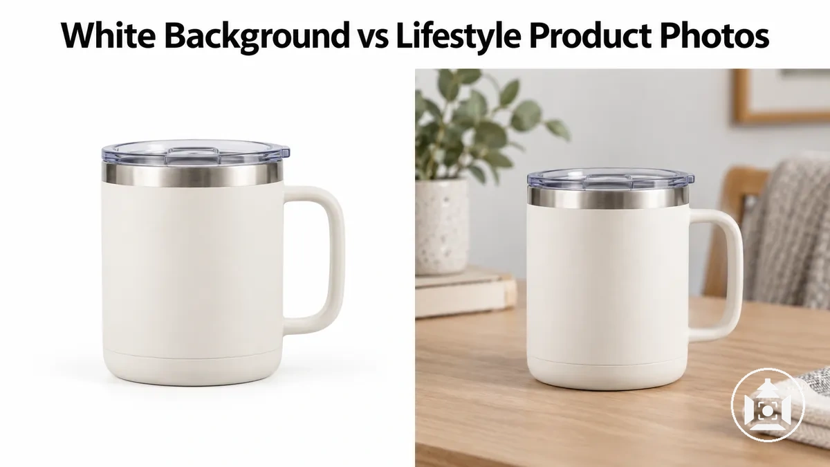
Choose the image role by the shopper’s unresolved information need
Use the primary information gap—not aesthetics alone—as the decision rule. Each row shows which image role most directly closes that gap.
| Shopper information need | Best image role | What it communicates |
|---|---|---|
| Inspect shape, colour, finish, packaging, or small visible features | White background | Product-first visibility with less environmental distraction. |
| Understand use, fit, relative scale, environment, or interaction | Lifestyle | Contextual cues from people, objects, and the setting; relative scale is interpretive rather than an exact measurement. |
| Keep a catalogue visually repeatable across multiple products | White background | A controlled scene that reduces background variation between listings. |
| Express mood or show the product in a brand-relevant setting | Lifestyle | More room for environmental and storytelling cues, provided the product remains clear. |
| Need both product inspection and real-world context | Use both | Assign separate, non-duplicative roles: isolated images for inspection and lifestyle images for context. |
Decision rule: use the strongest unmet information need to choose the image role; neither style is a universal winner.
White-background imagery primarily reduces contextual distraction to emphasise product clarity and product detail, while lifestyle imagery primarily adds contextual information about use, environment, and scale.
The appropriate ecommerce image role depends on what the shopper needs to understand from the image.
Isolated product images support close attention to the product itself and can support catalogue consistency, whereas in-context product images can show how the product relates to a real-life setting and provide more scope for brand expression.
These functions are complementary: product clarity, context, scale, catalogue consistency, and brand expression provide distinct dimensions for comparing the two approaches.
Effects on engagement, trust, or conversion cannot be inferred from photo style alone because they also depend on the product, audience, channel, and execution.
A consistent comparison therefore starts with the information each image needs to communicate before considering broader commercial outcomes.
Table of Contents
Comparison Criteria for White Background and Lifestyle Product Photos
White-background and lifestyle product photos should be evaluated according to the information an ecommerce image needs to communicate, not aesthetics alone.
Image-style suitability changes according to whether the page needs stronger product inspection, contextual understanding, catalogue consistency, or brand expression.
The main evaluation criteria are product focus and detail visibility, contextual information and scale, catalogue presentation, and brand communication.
Their relative importance depends on the product and page purpose: a detail-sensitive item places greater weight on inspection, while a product whose size or use is difficult to interpret in isolation places greater weight on contextual information.
The image below highlights these evaluation dimensions across matched white-background and lifestyle examples so the criteria can be assessed without treating either style as the default choice.

- Product inspection: Evaluate product focus, detail visibility, and how clearly important visible features can be inspected. This criterion carries more weight when shape, surface detail, finish, or other visible product attributes are central to understanding the item.
- Contextual understanding: Evaluate whether context, scale, real-world use, or surrounding objects are needed to interpret the product. Greater dependence on these cues indicates a stronger fit for an image style that can communicate them clearly.
- Catalogue presentation: Evaluate how consistently products need to appear across listings or a wider range. Catalogue consistency carries more weight when shoppers need a repeatable visual presentation for comparing multiple items.
- Brand communication: Evaluate how much the image needs to express mood, environment, or recognisable visual cues beyond the product itself. Brand expression carries more weight when those contextual signals form part of the intended ecommerce image role.
Product Focus and Detail Visibility
White-background images can strengthen product focus by reducing environmental information that competes for attention, making the product's shape, texture, colour, finish, edges, and small features easier to isolate visually.
Lifestyle images add surrounding context, so detail visibility may remain clear or become less prominent depending on how the product is presented within the scene.
The image illustrates this inspection difference without implying that either treatment guarantees greater image quality.
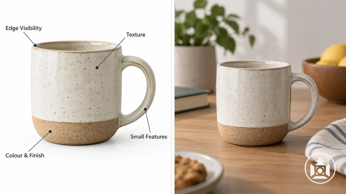
For product inspection, edge visibility affects how easily the item's outline and shape can be distinguished, while feature legibility affects whether small functional or decorative details remain recognisable; texture, colour, and finish also need enough visible information for useful evaluation.
A detail-sensitive accessory or packaged product, for example, can benefit from isolated presentation when surrounding objects would compete with small features.
Actual visibility still depends on crop, lighting, resolution, styling, and product characteristics; product photo composition and framing can also affect which details remain visible within the image.
Context, Scale, and Real-World Use
An in-context product photo can provide context, scale, real-world use, fit, environment, and product interaction cues that an isolated image may omit.
When reference objects or people are visibly related to the product, they can help a shopper interpret relative size, intended use, and how the item sits or functions within its surroundings; these scale cues are comparative, not exact measurements.
These contextual cues are useful when the scene supports an accurate interpretation, but staging, reference objects, perspective, and product type can also make context ambiguous or misleading.
The image below illustrates how the same product can gain additional scale, use, and environmental information when shown in context.
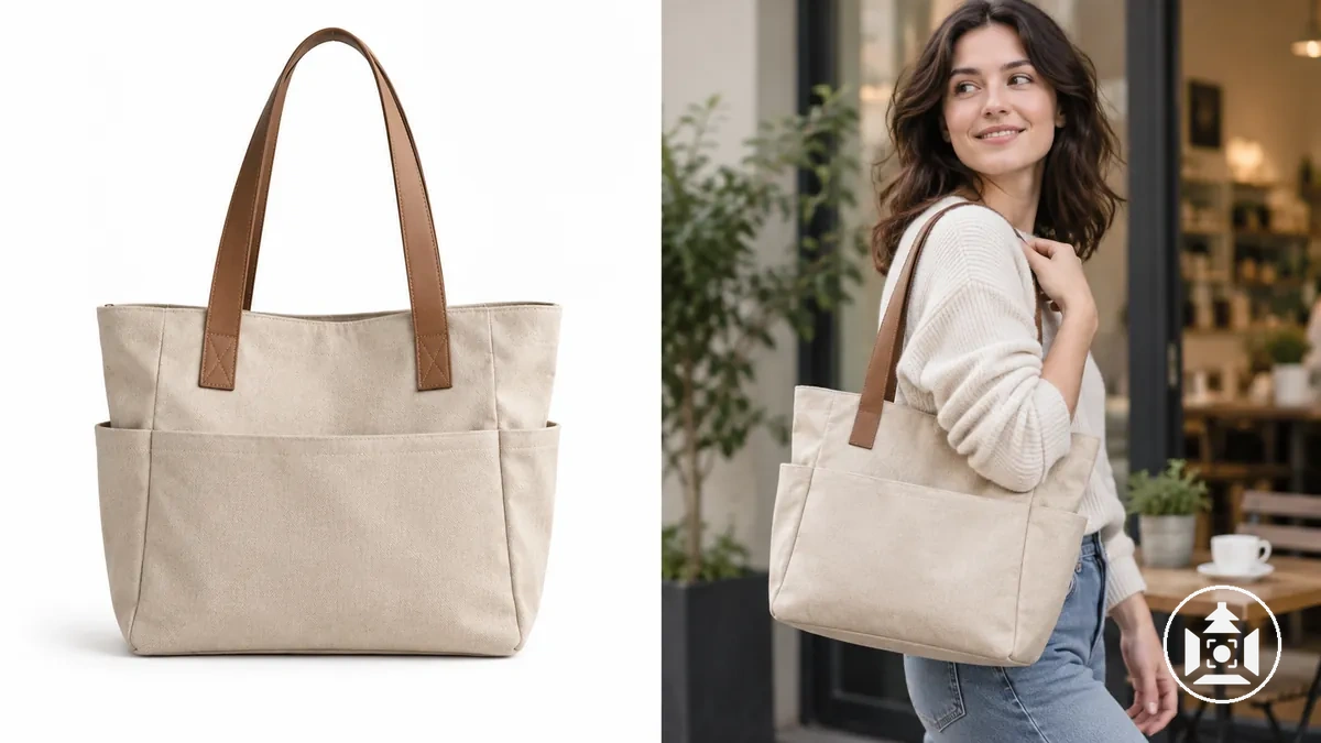
- Scale: A familiar surrounding object can provide a visual reference for relative size, making the product's dimensions easier to interpret without implying an exact measurement.
- Fit: Showing the product in relation to a person, compatible object, or intended space can suggest how it fits within that specific use condition.
- Real-world use: Visible product interaction can communicate intended use by showing how the item relates to a user or another object during a plausible activity.
- Environment: The surrounding setting can indicate where the product is intended to be used, but an unsuitable or ambiguous environment can create a misleading interpretation.
For example, a bag may be visually clear against white while an in-context image showing it carried beside familiar objects makes its relative size and intended use easier to interpret.
These contextual roles vary across ecommerce product photography types, without making contextual presentation necessary for every product or page.
Visual Consistency and Brand Storytelling
Catalogue consistency and brand storytelling are related but distinct presentation attributes.
Catalogue consistency concerns visual consistency and controlled variation across a product range, while brand storytelling uses mood, environment, and recognisable cues to support brand expression and a visual narrative.
White-background images can reduce contextual variation across listings because fewer environmental elements change from product to product, whereas lifestyle imagery can carry more contextual and expressive cues but requires greater control over those cues to remain coherent across a catalogue.
Neither consistency nor storytelling establishes perceived quality or higher sales by itself; those effects depend on execution and the ecommerce context.
The image below illustrates how repeatable product presentation and contextual brand expression can remain distinct within the same product range.
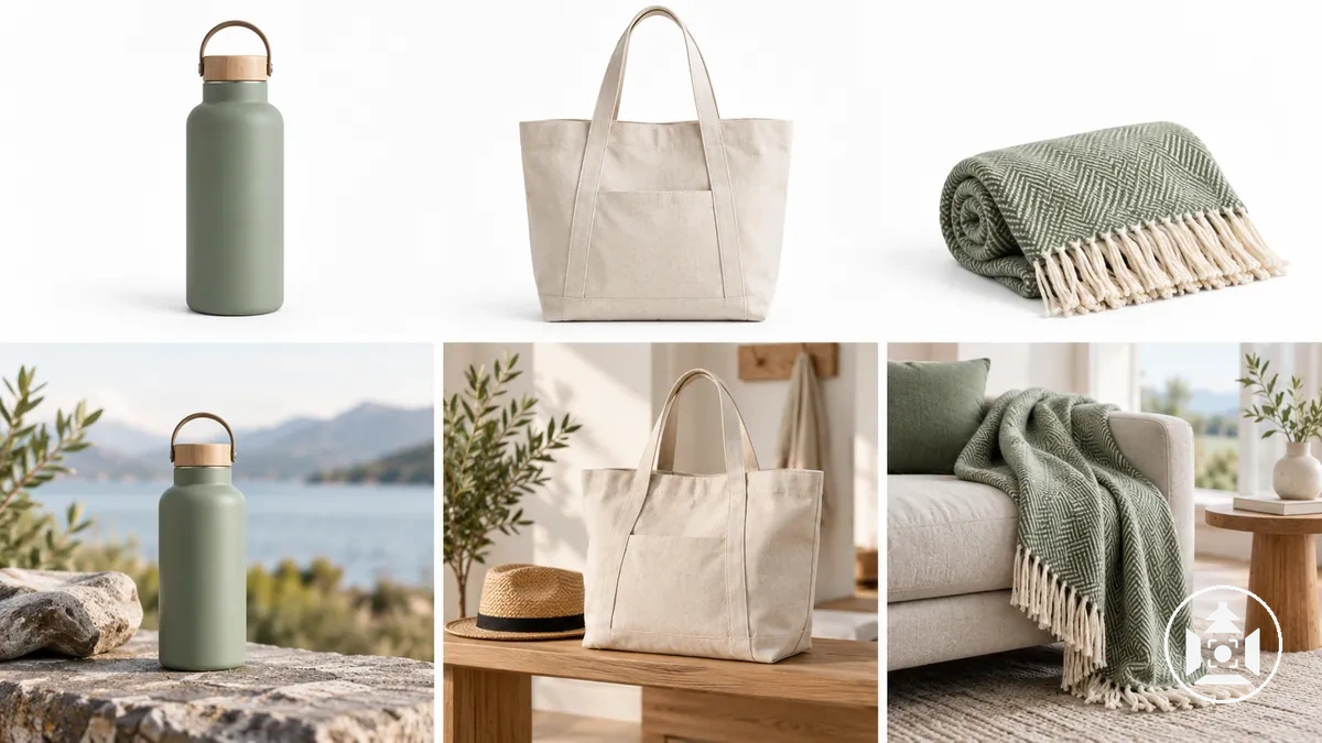
- Consistency: Repeating core presentation characteristics across products can limit unnecessary visual variation and support a coherent catalogue presentation.
- Mood: Lifestyle imagery can express a visual mood through contextual elements while keeping the product recognisable as the principal subject.
- Environment: The setting can contribute to brand storytelling by placing products in a recurring type of context, provided the environmental treatment remains coherent across related images.
- Recognisable cues: Repeated visual cues can connect different product images to the same visual narrative even when the image role or surrounding context changes.
For example, a multi-product catalogue can use repeatable isolated images for product-range presentation while selected lifestyle images vary the setting but retain recognisable visual cues such as a recurring mood or environmental treatment.
Maintaining consistent catalogue presentation therefore concerns controlling repeatable visual relationships across the range rather than making every image identical.
Advantages and Trade-Offs of Each Photo Style
White-background and lifestyle product photos offer different advantages on the same comparison basis rather than a universal hierarchy.
White backgrounds emphasise clarity, product isolation, and consistency, while lifestyle images provide more context, expressive flexibility, and environmental storytelling; the suitable context depends on the product information and page role.
Each strength creates a corresponding trade-off under some ecommerce conditions: reducing environmental information can simplify catalogue presentation but limit real-world interpretation, while adding context can communicate use and setting but introduce more visual variation.
The image below illustrates the physical difference between isolated and contextual presentation, while the comparison block pairs each advantage with the trade-off created by the same visual choice.

| White Background Photos | Lifestyle Photos |
|---|---|
| Clarity: Product isolation limits competing environmental information, which suits pages where inspection of the item itself is the priority; the trade-off is less context for interpreting the product in use. | Context: The surrounding scene can provide information about use and environment, which suits products that benefit from real-world interpretation; the trade-off is more contextual information competing with the isolated product. |
| Consistency: A controlled background can reduce variation across catalogue images, supporting straightforward product-range presentation; the trade-off is less expressive flexibility from the setting. | Expressive flexibility: Different settings can carry mood, usage, and brand cues, supporting a broader visual narrative; the trade-off is greater variation that requires control to keep related images coherent. |
| Product isolation: Showing the item without an environment keeps attention on the product, which suits catalogue roles centred on the item itself; the trade-off is limited environmental storytelling. | Environmental storytelling: Showing the product within a setting can communicate how it relates to people, objects, or surroundings; the trade-off is reduced visual isolation of the product. |
| Catalogue use: A repeatable isolated presentation suits listings that need a consistent visual basis across multiple products; the trade-off is fewer cues about real-world use. | Real-world interpretation: Contextual imagery can provide richer cues about how a product is used or situated, which suits pages where those cues resolve uncertainty; the trade-off is a less uniform presentation across products when scenes vary. |
White Background Photo Advantages and Trade-Offs
White-background product photos isolate the product, reduce environmental distraction, and emphasise the item through a visually simple scene.
This controlled background state also supports repeatable presentation across multiple products, making it suitable for straightforward catalogue and listing roles where consistent product emphasis matters.
The same simplicity creates a trade-off because white-background photos can omit contextual information that helps shoppers interpret relative scale, intended use, or environment.
When those cues are important, isolated presentation may need complementary contextual imagery; broader product photography background choices determine how much environmental information surrounds the product.
Lifestyle Photo Advantages and Trade-Offs
Lifestyle product photos show products in an in-context scene that represents real-world use, where visible product interaction, surrounding objects, or people can provide scale or fit cues and establish environmental relevance.
The scene also creates more space for visual storytelling by showing how the product relates to a real-life setting rather than presenting it in isolation.
The added context creates a trade-off: surrounding elements can introduce distraction or ambiguity, varied environments can make presentation less consistent, and more contextual elements may complicate execution.
For example, an isolated image of a bag can show the product clearly but leave its fit against the body uncertain, while a lifestyle image showing the bag being carried can provide a visible fit cue; that interpretation remains dependent on the person, perspective, and scene shown.
Choosing the Right Photo Style for the Product and Ecommerce Page
Photo-style suitability depends on the product information need a shopper still has on the ecommerce product page.
The decision should therefore match the image role to the unresolved need, such as inspection, scale or usage context, or catalogue consistency, rather than treating either style as universally preferable.
Use the strongest unmet information need as the decision condition: precise inspection supports a white-background role, while scale, fit, or usage context supports a lifestyle role.
When catalogue consistency matters alongside contextual interpretation, a complementary mix may be more suitable because the two image styles can carry different information roles.
- Inspection need: When the product itself needs clear visual isolation for inspection, a white-background image is more suitable for that role.
- Scale or usage-context need: When shoppers need contextual cues to interpret scale, fit, environment, or use, a lifestyle image is more suitable for that role.
- Catalogue consistency need: When repeatable presentation across multiple products is important, white-background imagery supports a more controlled catalogue role.
- Mixed information need: When one image style cannot communicate both isolated product information and necessary real-world context, a complementary mix can assign those functions to separate images rather than forcing one style to carry both.
When White Background Photos Fit the Need
White-background photos fit best when product inspection, low distraction, or uniform catalogue presentation is the primary information need.
Their isolated presentation can keep colour, shape, finish, packaging, and other visible product details separate from environmental context.
- Inspection-led need: When shoppers need to inspect colour, shape, finish, packaging, or other visible details, a white background supports product inspection by reducing scene distraction and isolating the item.
- Consistency-led need: When a catalogue needs a repeatable presentation across multiple products, isolated product photos can support more consistent item-to-item visual comparison by limiting variation from surrounding environments.
- Context-limited exception: White-background photos may be insufficient when scale, fit, function, or real-world use remains unclear without contextual cues; in those situations, contextual imagery can supply information that isolation does not show.
When Lifestyle Photos Fit the Need
Lifestyle photos fit best when shoppers need contextual information about use, environment, relative scale, fit, or interaction to interpret the product.
Brand-relevant context can also be suitable when the setting clarifies the product's role rather than functioning as decorative styling that adds distraction without useful information.
- Use and interaction need: When understanding the product depends on seeing how it is handled, worn, positioned, or used with another object, a lifestyle photo can show the relevant interaction and environment directly.
- Scale and fit need: When an isolated image leaves relative scale or fit uncertain, familiar people, objects, or spaces can provide reference cues that change shopper interpretation; for example, showing a lamp on a desk can clarify its relative size and spatial role more effectively than showing the lamp alone.
- Contextual or brand need: When brand-relevant context helps explain where or how the product belongs, an in-context product photo can supply that setting. The scene may become less suitable when decorative elements obscure the product or introduce ambiguous cues that do not help interpret it.
When Both Styles Serve Complementary Ecommerce Image Roles
A complementary image set is useful when white-background and lifestyle photos resolve different product uncertainties rather than duplicate the same information.
Combining the styles adds value when each image serves a distinct information role.
White-background images can support product inspection and consistent presentation, while lifestyle images can supply use context, scale, environment, or other contextual information.
The appropriate combination can vary with product complexity, available image slots, and page design, but mixed usage is useful only when each style contributes non-duplicative information.
For example, with a handbag, the two styles can divide information duties without repeating the same product information:
- Isolated-image role: A white-background image can show the handbag's shape, finish, closures, and other visible details for product inspection while maintaining a consistent presentation with related products.
- Lifestyle-image role: An image showing the handbag being carried can provide relative scale and use context, reducing uncertainty about how the product relates to the person and surrounding environment.